Microsoft is now fully revealing that it will deliver a next-gen version of Windows on June 24. All estimates for this new version indicate that the chosen name will be Windows 11.
With this great update, everyone is waiting for a rebrand and especially a slight change to the logo of the classic Windows flag. But the question we have to think about is:
I want you to know that what I am going to write here is already theory, but I made research before sharing these tips.
Rumors about the new logo are as follows;
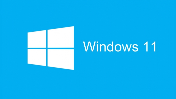
Microsoft wants the logo to be "the characteristic blue of Windows 10" or use a similar shade of blue in all cases. Blue has always been a color closely associated with Windows, and the people who follow Redmond may want to continue the branding of Windows 10.
In addition, the June 24 presentation image of the event points to shades of blue that could predict a rebrand.
The white monochrome version on a blue background looks quite successful. The shade of blue may vary, but while some forums talk that the logo may be monochromatic, it is believed that a few different combinations of blue, perhaps even some kind of gradient, can be offered. Doubts still remain on this matter.
It's hard to bet on a possible blue combination of the logo, especially as we know they won't be exactly the same as the logos previously used by Windows 10X. However, I offer different logo suggestions for Windows 11 below.
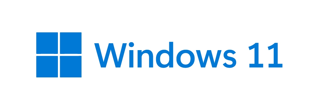
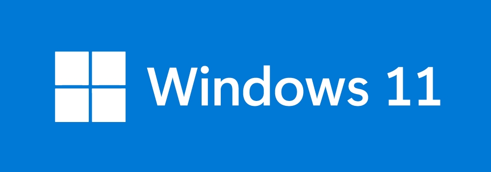
This logo will do its new job perfectly as a continuation of the existing logo and also by distinguishing itself from the old ones with the changes highlighted earlier, as the logos were very popular during the transition from Windows 7 to Windows 8 and 10. In fact, the people really liked It this logo so they used only Windows logo on their wallpapers.
Undoubtedly, this logo issue is one that Redmond takes very seriously.